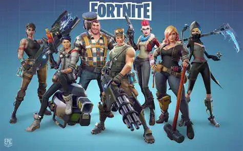
Design Appeal in Fortnite Battle Pass
The open-world sandbox game Fortnite invites its players to a visually engaging yet straightforward User Interface (UI). Despite being out in various versions, Fortnite has consistently managed to keep players glued via its Battle Pass UI, having made changes from season to season.
The Battle Pass, a prominent feature in Fortnite, carries unique characteristics every seasonal upgrade. As each new season unveils, players are introduced to freshly designed Battle Pass interfaces, enhancing the overall appeal.
Digging down the memory lane, it is interesting to see how Fortnite's Battle Pass has varied design-wise. Influenced by player feedback, practical experience, and changing aesthetics, these changes have kept the UI interesting for all users.
First Iterations: Season 2 to Season 3
In the early seasons, the Battle Pass design was simple, listing the rewards on horizontal sliding tabs. With only basic features like color variants to provide some differentiation, this design had a no-frills approach.
However, the list was long, making it slightly tough for players to track and anticipate rewards. How far they've come, what's next, and how long till the next reward - such details seemed lost in the long list.
There were definite positives, though. The design was less cluttered, making it more appealing to those favoring a minimalist experience. Also, showing every reward simultaneously meant a clear, complete view at a single glance.
The design in Season 3 didn’t change much, making some players feel that the developers had missed an opportunity to refresh the interface.
Major Changes: Season 4 to Season 6
Season 4 brought significant design shifts. The horizontal scroll bar held each tier of the Battle Pass separately, breaking the monotony of the long list design, and allowing segmented viewing of rewards.
This version was more lively and appealing visually. Furthermore, the design offered distinct milestones to players, which were missing in previous iterations. But challenges were somewhat buried, requiring separate navigation.
Season 5 & 6 carried forward this new segmented design, also adding 3D visualization for higher tier characters. The change was mostly applauded, but some raised concerns about the clarity and navigation complexity on the rewards page.
But this design stayed a favorite amongst many, with players complimenting the aesthetics and better segmentation.
Seasons 7 to 9 - A Mix of Minimalism and Detail
The subsequent seasons saw an integrated Battle Pass and Challenges page, addressing the critique from previous seasons. This made the access to challenges straightforward rather than having a separate section for them.
The design turned more tidy and minimalistic, yet kept the glitz intact with well-defined segments for each reward tier. This balanced approach attracted positive feedback, with a lot of players finding it sleek and easy to navigate.
Given the ideal blend, this became a firm favorite among users. Many pointed out the design's simplicity as its most appealing factor, and the way it laid out the challenges with the rewards drew particular praise.
Overall, these seasons managed to deliver a compact, visually pleasing yet practical Battle Pass design, hitting a sweet spot for many players.
Turning the Page – Seasons X & Beyond
Season X rolled out a completely redesigned UI in the form of a 'comic book'. With each reward having its unique page, the design aimed at encapsulating the reward in a thematic way, amplifying its impact.
This change received a mixed response. While many complimented the enhanced visual appeal, some found the presentation exceedingly ornate.
A significant criticism stemmed from the missing option to view all the rewards conglomerated. Also, the reward sequence wasn’t very intuitive, making players miss out on itemized comparisons between rewards.
The newer versions of the Battle Pass UI built upon the aesthetics, more or less continuing with the comic book form, but with increasingly polished graphics and animations.
Conclusion
Over the years, Fortnite's Battle Pass has seen significant transformations, both in terms of design and functionality. With clear influences of player preferences and feedback, the design evolution is far from over.
Design appeal might vary individually, and Fortnite's developers have managed to deliver different iterations based on popular feedback while keeping things fresh and exciting. The design fluctuates between minimalism and detailed, thematic layouts, often finding a perfect blend of both.
It would be exciting to witness the forthcoming changes and how they shape the Battle Pass user experience. As is apparent, each new design brings something unique to the table, enhancing the game's overall appeal and user experience.
Fans certainly have their favorites, just as they have preferred seasons, characters, and gameplay styles. Whether nostalgic for earlier designs or prefer newer, flashy interfaces, the Fortnite Battle Pass offers something for everyone.